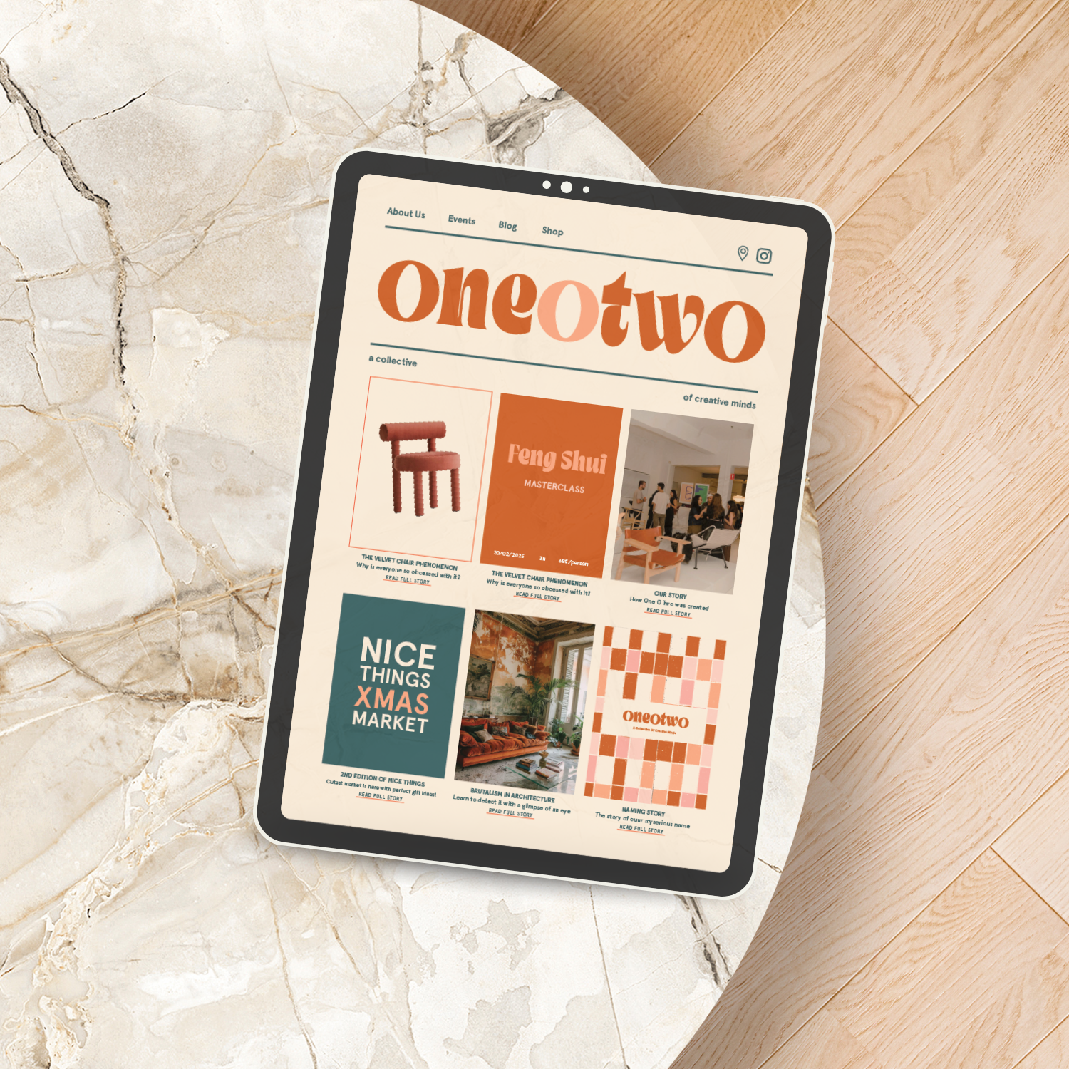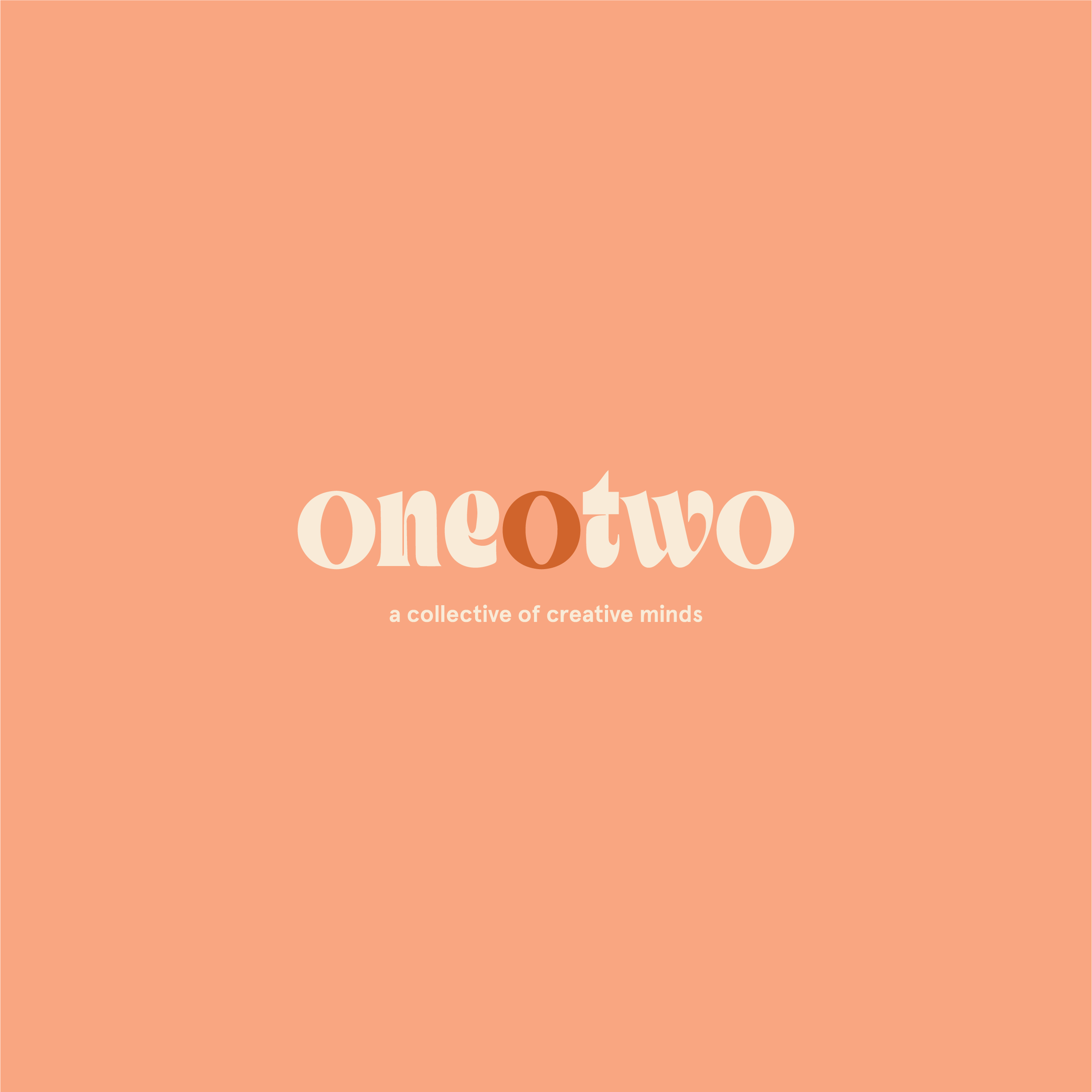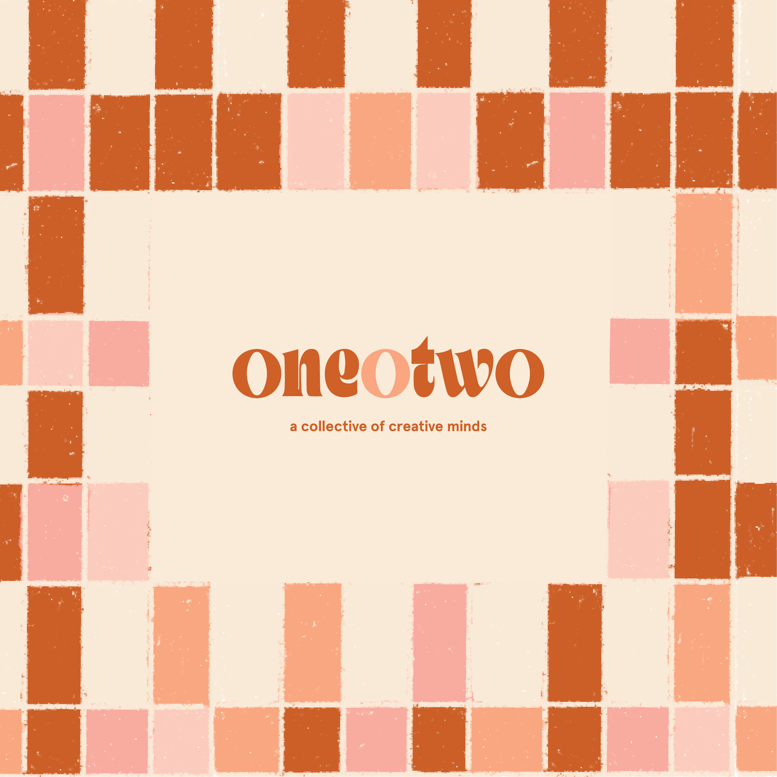
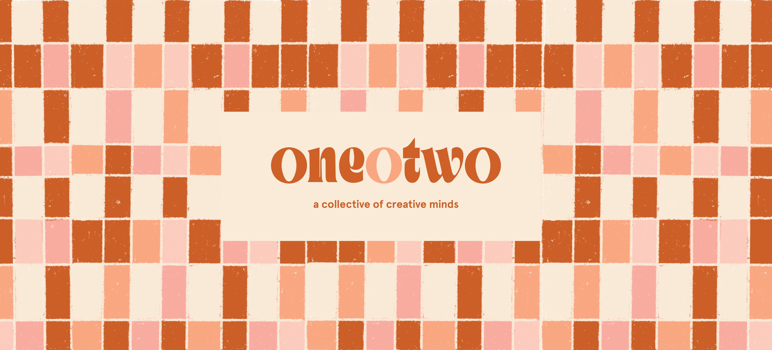
oneotwo
One O Two is a creative hub rooted in design, culture, and community. It brings together three key elements: personalized architectural and interior design services by Cantero Architecture, a curated shop featuring unique products, coffee, and events, and a dynamic program of talks and workshops on design, culture, and architecture. More than just a space, One O Two is a place to connect, collaborate, and be inspired.
-
The name One o Two is modern, creative, inspired by the address of the first location, 102. The number has a deeper significance, as when broken down, it adds up to 3 —a nod to the trio of founders behind the brand. The name itself is cool, effortlessly memorable, and intriguing.
-
The slogan “a collective of creative minds” is intentionally written in all lowercase letters to reflect the brand’s inclusive, approachable, and down-to-earth spirit. It captures the essence of ONE O TWO as a space where creativity is shared, not owned—where architects, designers, artists, and neighbors come together to collaborate, inspire, and build meaningful connections.
-
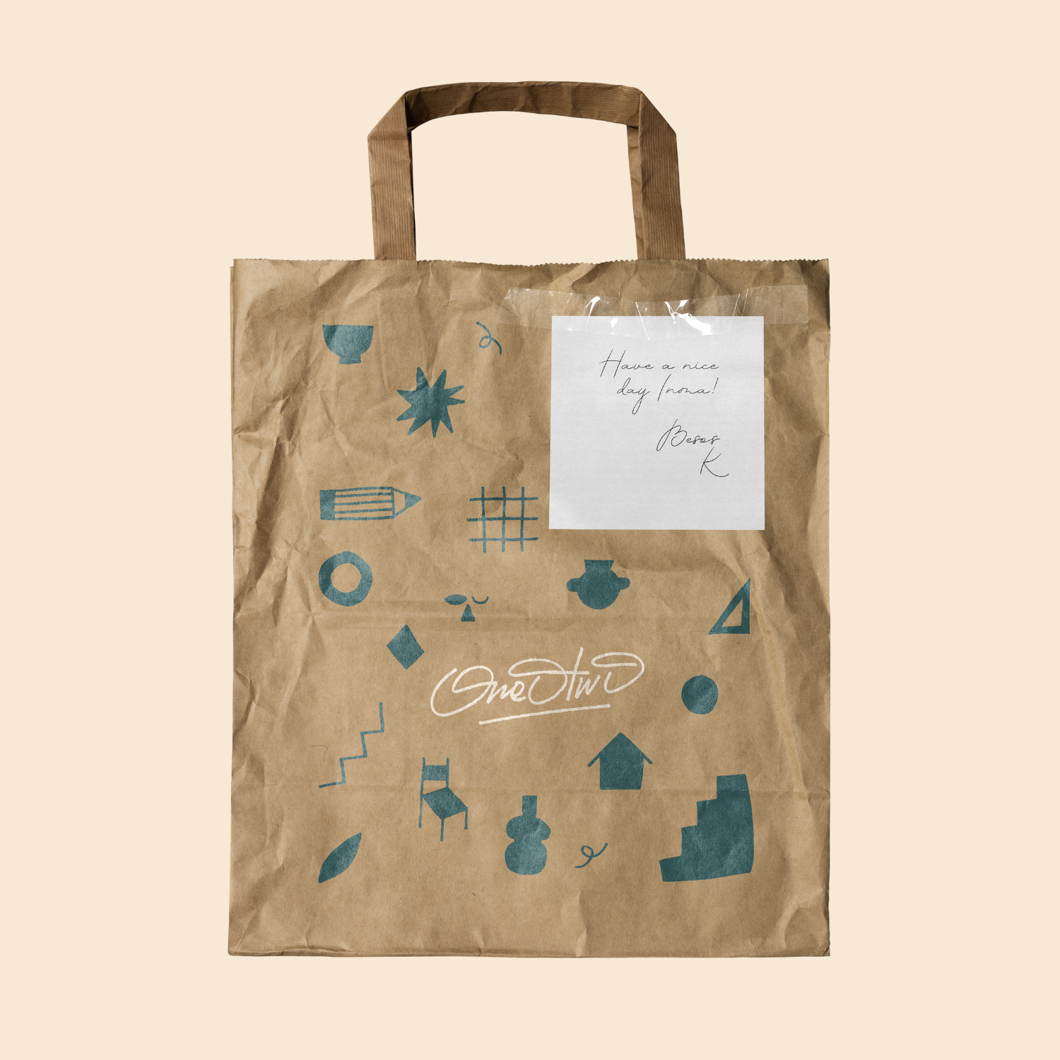
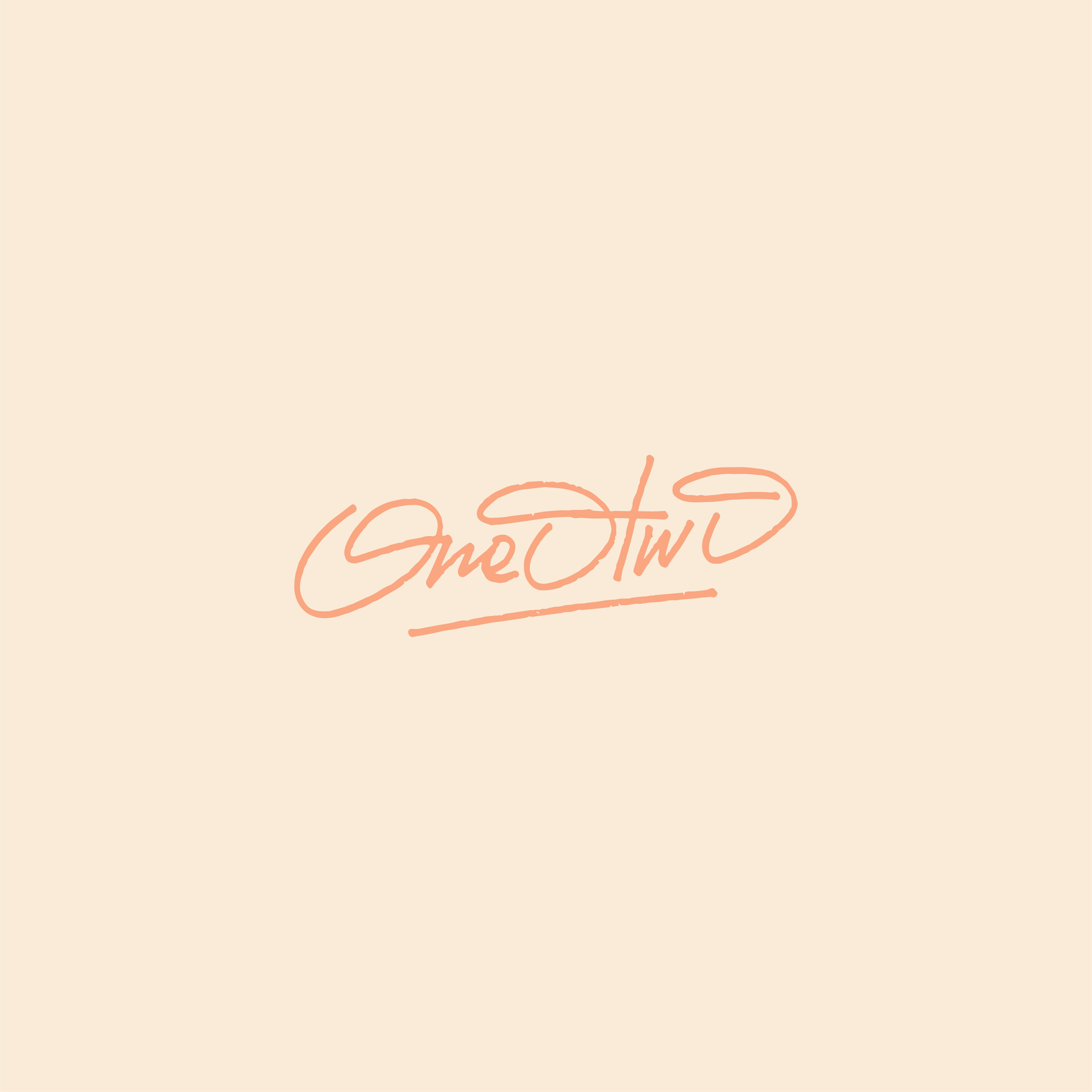
The ONE O TWO logo comes in three distinct versions. The first is a clean, all-lowercase wordmark in TAN – KIOSK, combining playful details with professional clarity. The second adds the slogan “a collective of creative minds” in Aperçu Bold, emphasizing community and collaboration. The third is a handwritten version with a bold “O” and dynamic underline, bringing a raw, personal touch—perfect for creative or informal use.
-
The ONE O TWO color palette features deep blue, terracotta, off white, and peach—carefully chosen to reflect the brand’s creative and community-focused identity. Deep blue adds trust and depth, terracotta brings earthy warmth, off white offers clarity, and peach adds a soft, inviting touch. Together, they create a warm, modern, and versatile look that feels both professional and personal.